

Could you imagine living in a world of black and white or shades of gray? How boring, right? We have color all around us and many times we don’t even know how different colors affect our mind or emotions, but they do! If you’ve ever heard of or dealt with SAD (seasonal affective disorder), you know the lack of sunshine and overcast gray weather can produce mood shifts or even depression. From a branding, marketing, and advertising perspective however, the psychology of color plays a huge role in the effectiveness of your message. Let’s dive into this interesting subject this week…
If you already know what I’m talking about, great! Perhaps you’ve studied it, or you’ve paid attention to how your mood and mental state is affected by different colors, words, decor’ or organization factors in your home, office, standing in line at a grocery store, or even when you’re at a doctor’s office. If you haven’t paid attention, consider this an invitation to do so.
The state of the world around us plays a very important role in our sanity and daily lives. When you are surrounded by chaos in your home, office, or vehicle – you feel unsettled and out of control. But did you know that color has an affect on that state, too?
Think for a moment about the daily things you encounter. When you’re driving, a red light or stop sign signals for you to STOP and a red firetruck alarms you that there is an emergency. But did you know that the color red can also stimulate your appetite and metabolism and raise your blood pressure? Because it is also the color of blood, it can create feelings of heightened anger, frustration, war, power, or agitation, causing passionate feelings. In marketing, red will grab attention and is likely to be more affective in a call-to-action.
Now think about the calming affect or consistency and strength of the ocean or water, or a bright blue sky on a sunny day. We bring blues into our surroundings to produce a calming, loyal, strong, dependable, or trusting affect. Think about that next time you’re looking at a paint sample or a pharmaceutical ad. They have likely very carefully chosen their brand and marketing/advertising colors to instill a sense of trust and calming confidence.

The color green is found everywhere in nature, right? It signifies growth, health, harmony, and also calmness as well as envy. Green can be a symbol of freshness and new life, even fertility.

What’s the first thing you think of when you think of the color yellow? The sun? A sunflower? Maybe it’s lemons, sour but fun. Yellow symbolized joy, happiness, energy, optimism, clarity, and intellect. It can be an uplifting color that stimulates giggling and laughter, or even a simple smile.
Orange in general can represent caution or an alert. Isn’t that what you think of when you see construction signs or an amber alert? Because it is a combination of yellow and red it can also bridge the gap between those feelings and and still exudes optimism, playfulness, and friendliness. It’s often used in male-dominated industries and advertisements.
The color purple is a mix of red and blue and represents luxury, royalty, power, wisdom, nobility, creativity, and mystery. Brands may use this rich and lavish tone to convey a feeling of intelligence and status. What brands have you seen using purple? How about Barbie, Yahoo!, or Taco Bell?
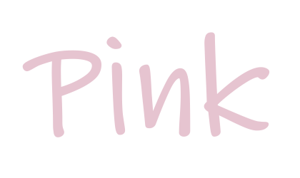
And finally, the sweet shade of pink. No matter what mixture of red and white your pink produces, this color is the sign of tenderness, softness, innocence, and hope. While it tends to skew toward the feminine, it can generate feelings of calm and ease and is delicate in nature. You may often see this color showcased in predominantly female lines or in infant and children’s brands.
What have you learned?
With all of this in mind, I ask you. What are your brand or marketing colors saying to your customers and the world? What are they representing and saying about your team, leadership, and the values and message you want your company to be known for? What are they asking your audience to do?
Is there a color you want to know about that I didn’t include? Ask and I’ll post an update.
Unless otherwise noted, every photo, caption, word, and all content on this site is property of Jamie Teasdale and Propel Businessworks, copyrighted, and may not be copied without prior approval.
